No Tofu, Please
Fixing digital typography one ❑ at a time
Before I start talking about tofu, I’d like to apologize for the month long hiatus. I kinda overwhelmed myself with a bajillion different university projects and I burned myself out. I’m gonna start posting again regularly, probably on a biweekly basis. Without further ado, enjoy.
In her book Thinking With Type Ellen Lupton opens with the idea that, “[t]ypography is how language speaks.” This is especially true with digital communication. While in the physical world we can still able to communicate through handwriting if we don’t have access to designed type, the same is not true of our digital world. In order to communicate online, it’s necessary that the devices we use are able to properly render the characters that our language uses.
I’m lucky, the two languages I speak — French and English — use the Latin script; which is the most supported alphabet as of writing this. However, if you don’t win the luck of the draw and are, for example, an Indigenous Canadian who desires to communicate in Inuktitut online, you’ll run into some annoying problems.
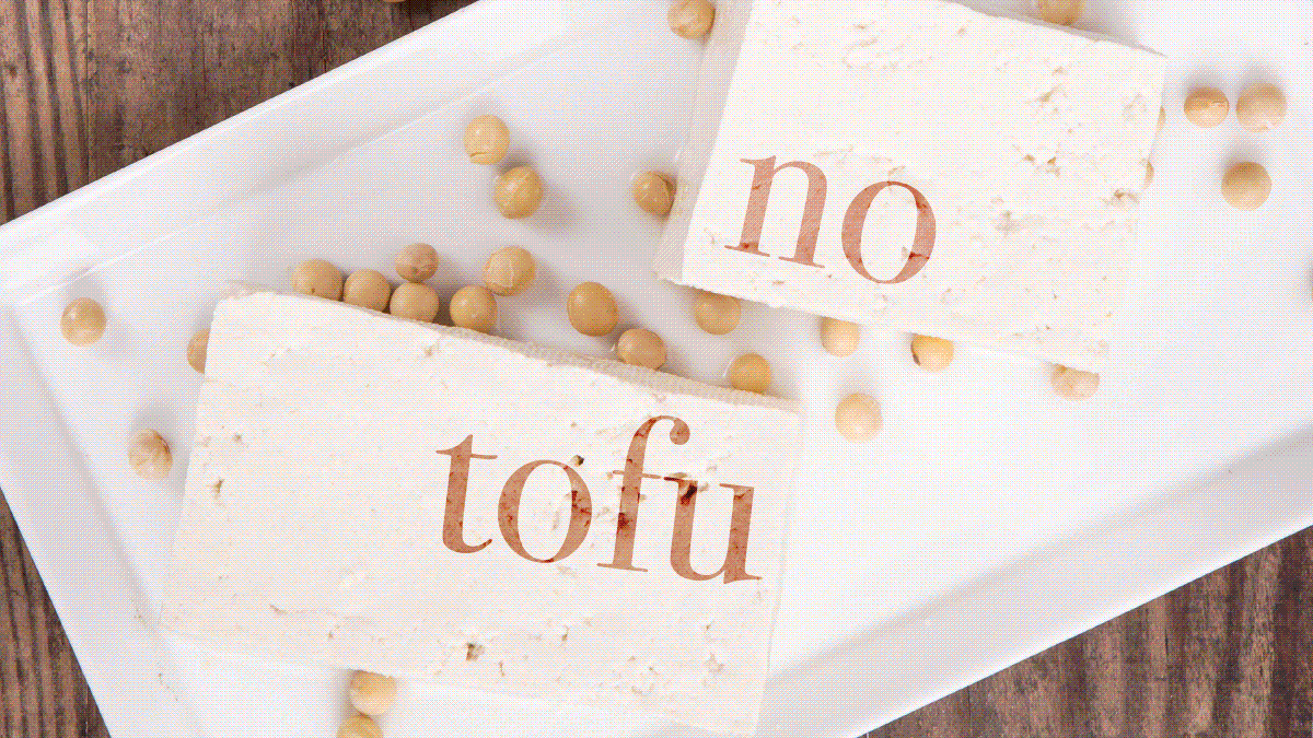
When characters that aren’t supported by any of your system fonts is rendered by a computer, the glyphs are rendered as tiny boxes referred to in type design as ‘tofu’. These little boxes are intended to tell users that their device doesn’t have a typeface on their system that can display the text that they wish to view.
As any graphic designer knows, getting well designed fonts usually costs money. A lot of it. So for the average user who may not be very tech savvy, who doesn’t wanna spend $400+ on a good type family, and who is trying to use a less common language, what are they supposed to do? Until recently there wasn’t much they really could do (that is other than settling to use a better supported language).
But in 2013 Google stepped into the ring. Whether it was out of good intentions or just sheer unadulterated hubris, Google created their Noto project. Noto stands for No Tofu, because Google’s goal with this project isn’t to support a lot of languages. No, Google intends to create a typographic Tower of Babel by creating a type super family that supports all of the languages.
As of writing this, the Noto Sans super family supports over 600 different languages. From Canadian Aboriginal Syllabics to Urdu to the Shavian alphabet. And the best part? It’s all free! Now this is in no way an advertisement for Google — they don’t need my help in that area — nor is it an unadulterated endorsement of the Noto Sans family. But you have to give Google some credit. Taking into consideration the sheer breadth of the project, they could’ve easily put Noto Sans behind a paywall. But whether it was a flex or just a move in favour of accessibility, they made it free to download and easily accessible by the public.