Optician Sans
A font that your eyes will remember
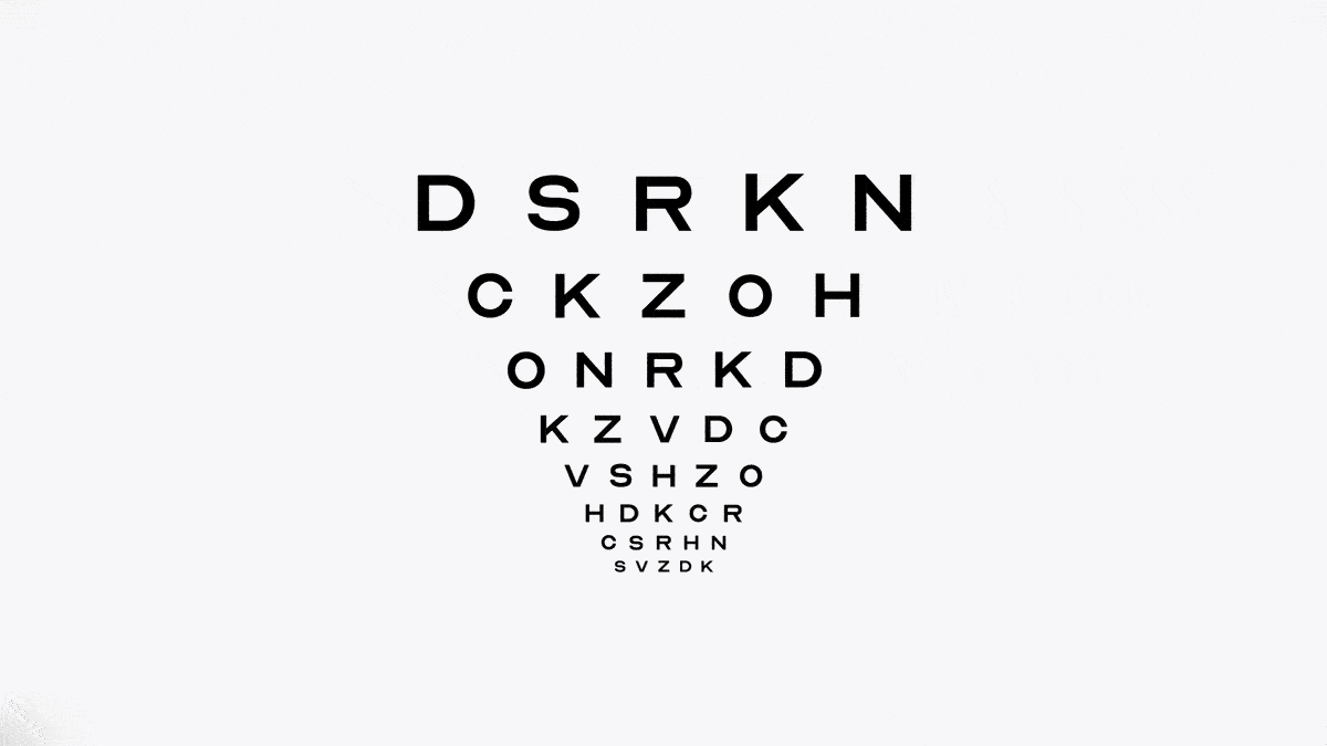
The font that you’ve read on eye charts was a lie, until now. The eye chart you’ve known for your whole life is a lie. Because the letters you read off of it don’t actually make up a whole alphabet. While you’ve probably never noticed it from the optometrist’s chair, there are only 10 unique letters on that chart — putting you 16 letters short of a usable typeface.
Since the advent of eye charts in 1862 with the Snellen Chart, we have become accustomed to reading the proportional even stroked typeface every time we visit the optometrist. But what you probably didn’t know was the letters aren’t a part of an actual typeface. In fact the Snellen Chart — as well as the Sloan and logMAR charts that proceeded it — only consist of 10 letters. From a logical perspective it makes complete sense: why would you design extra characters that you won’t use?
What this means is that for the past century and a half if you wanted to use these unique letters in your own project you had less than half an alphabet to work with. More specifically, you only had the letters c, d, e, f, l, n, o, p, t, and z.
However a century and a half later, the the design firm ANTI Hamar has finally filled in the gaps. Released as a free font under the SIL Open Font Liscence, Optician Sans aims to be the first known complete and functional eye chart font. The free font is based on the same visual principles that are used by the historical eye charts and optotypes, but tweaked so it is able to be applied as a fully functional display typeface. If you want to give this font a test drive, you can download Optician Sans here for free here.