A Humble Redesign
A designer’s work is never over
You may have noticed that the look of the website has been randomly changing over the past few months. My original goal with the layout of the website was to create something that would change and grow with me as a writer and graphic designer. The plan was to update it and add or remove features as I felt the need to. This was a bad approach.
Excluding minor updates and additions, I’ve cycled through about three substantially different layouts since last year. Each of them had their own upsides and downsides. But there was one thing that was true of all of them: the passable reading experience. After some review I realized that I was sacrificing the reading experience in favour of hip unconventional layouts. And while I was and continue to be an avid fan of the experimental web, it just wasn’t working for my blog.
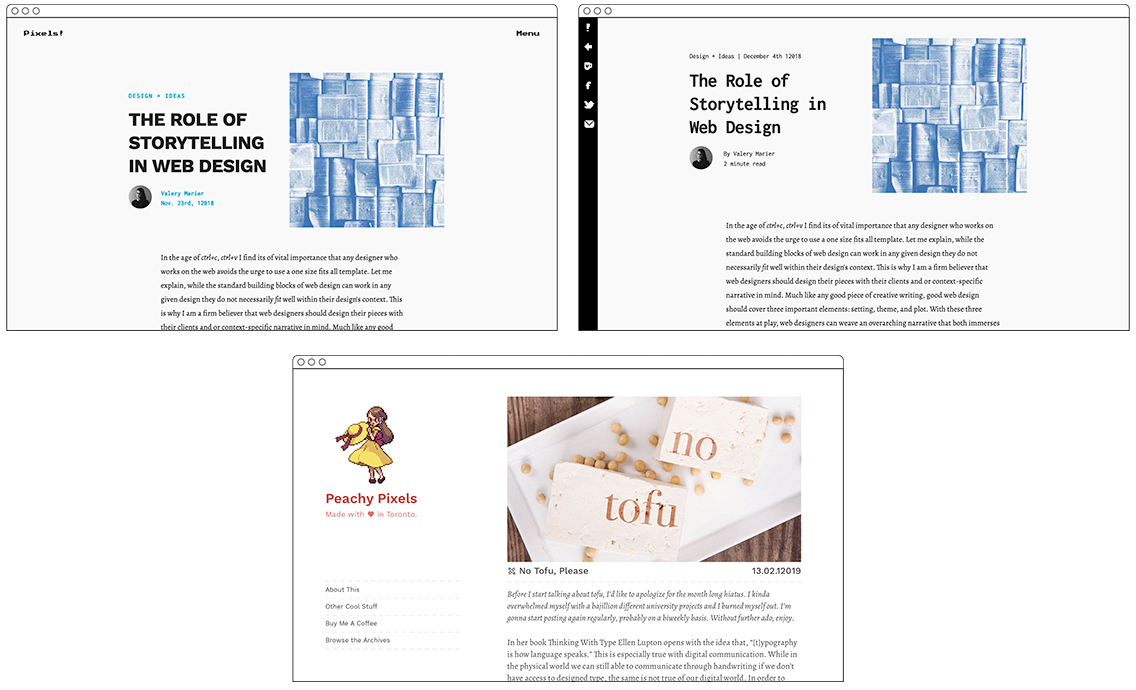
examples of articles in all of the past layout designs
That brings us to the humble redesign, Virginia. This redesigned layout is going to be the layout for the blog from this point forward. I feel that I struck the perfect balance between a good reading experience and an unconventional layout. Also, I am promising you dear reader that I will not dramatically redesign the website again for at least a year. Anyways, lets run through the features of Virginia:
- She’s fairly lightweight, she loads quickly on my 2010 MacBook ☺
- She fits on all screen sizes
- She’s really accessible, so anyone can look at her content
- Her typography is super legible, with a comfortable type size and a short 60-80 character line width.
- She’s really easy on the eyes: the background colour is a soft cream instead of white so your eyes don’t cry out for mercy while you read
- Her back to top button is a manicule
“My designs are stars I cannot fathom into constellations.”
— Some Nerd, Probably