Floppy Sleeves Were
Kinda Beautiful
Sometimes even save icons need a protective sleeve
My favourite part about studying graphic design is learning about all the thought that goes into the things we don’t think about. But sometimes I find that, somewhat ironically, a lot of designers tend to ignore the thought that goes into the things they don’t think about.
That brings us to today’s piece. Recently, while surfing the Internet Archives — one of my favourite things to do as of late — I came across a collection of old 5 ½ ″ floppy disk sleeves. Scanned by American Archivist Jason Scott, it appears that the collection is completely random and represents the unique designs that passed through Scott’s hands in this past January.⚬ What struck me the most was how beautiful, unique and visually pleasing these floppy sleeves were. I’ve picked some of my favourites from Scott’s collection and annotated them. I hope you like them as much as I do.
apple computers
floppy sleeve
circa 1977
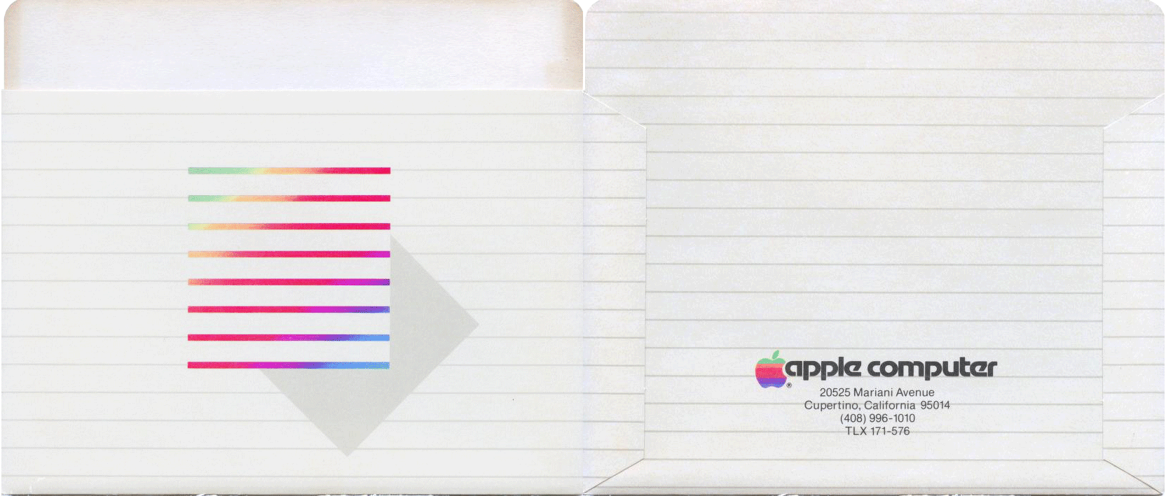
Much like their computers today, this Apple floppy sleeve is clean and elegant. I especially like the horizontal line motif that they used on the front and back of the sleeve. The designer used contrasts of stroke weight and colour to create the illusion of a square on the front of the sleeve. They also added a grey polygon to the bottom right of the coloured square to add the illusion of depth to the design.
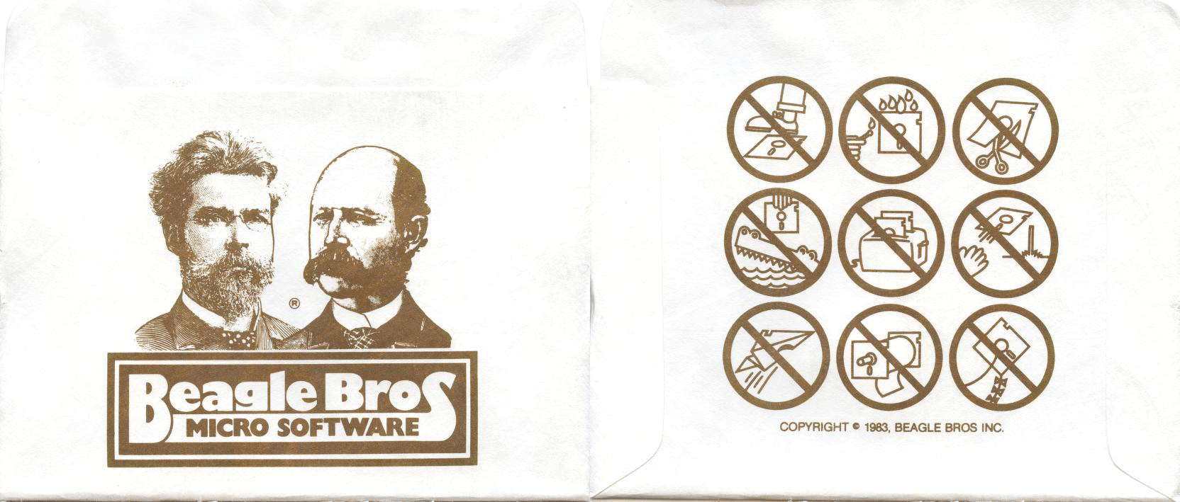
beagle bros inc.
floppy sleeve
1983
the software toolworks
floppy sleeve
roughly 1975–1995
This one makes me happy for two reasons. First off, it reminds me of playing Oregon Trail on my elementary school’s Windows XP machines when I was a younger. Second, I love the idea of a modern day Pony Express that’s used solely for data transfer. It reminds me of the time that xkcd looked into the bandwidth of FedEx ⚬. Remember kiddos, “Never underestimate the bandwidth of a station wagon full of tapes hurtling down the highway.” — Andrew Tanenbaum, 1981.
3m diskette
floppy sleeve
roughly 1975–1995

This sleeve relies purely on a contrast of colour in its design. It utilizes a sharp red colour to juxtapose the text “continuous error free data with 3m diskettes” with the rest of the text. The red tone makes the important information pop out to the viewer.
memorex
floppy sleeve
roughly 1975–1995
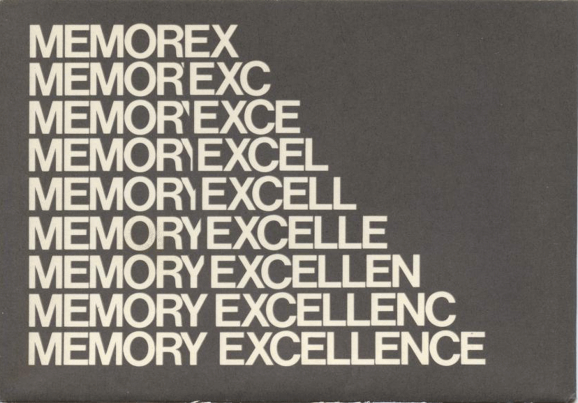
This piece solely uses typography to tell the viewer the company’s mission statement. It implies that the process of rewriting their disks is seamless and error free through the seamless, clean transition from their brand name memorex to their mission statement, memory excellence.
antic magazine
floppy sleeve
roughly 1975–1995
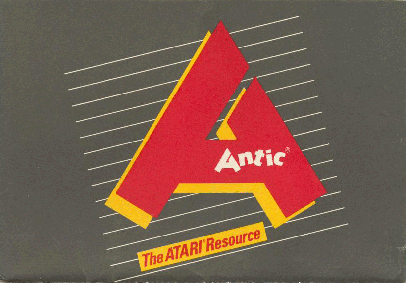
I absolutely love the use of colour in this piece. It uses a warm tone of red and yellow on a medium grey background. The different contrasts in size and direction in combination with the use of colour make the sleeve feel quirky and playful. Furthermore, the way that the type is composed in the piece along with the thin white lines make the sleeve feel like the perfect embodiment of the 80s.
analog magazine
floppy sleeve
roughly 1975–1995
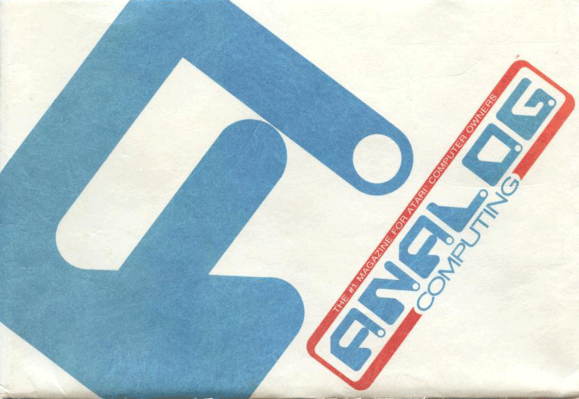
The designer of this sleeve applied contrast in size, space and form in this piece. They copied the letter A from their magazine’s wordmark and blew it up in a way that created the illusion of depth and space in the design. This also served to highlight the unique shapes in the typographic forms and their relationships with one another.
If you would like to explore Jason Scott’s collection in its entirety, you can do so by clicking here.