Why I Love the Most
Hated Font on Earth
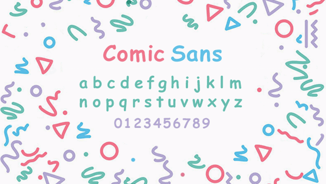
A love letter to Comic Sans
It’s unfair to throw Comic Sans in with the ranks of bad fonts like Papyrus — the font equivalent of the five o’clock shadow — or the Arial — Helvetica’s drunk, clingy cousin. And while there has been attempts to make Comic Sans a better and more beautiful, it is my sincere belief that most people ignore the inherent beauty of the original typeface. In an interview with The Guardian Tom Stephens describes Comic Sans perfectly calling it, “almost an anti-technology typeface: very casual, very welcoming. Its like going home, back to your childhood, getting letters from family members.”
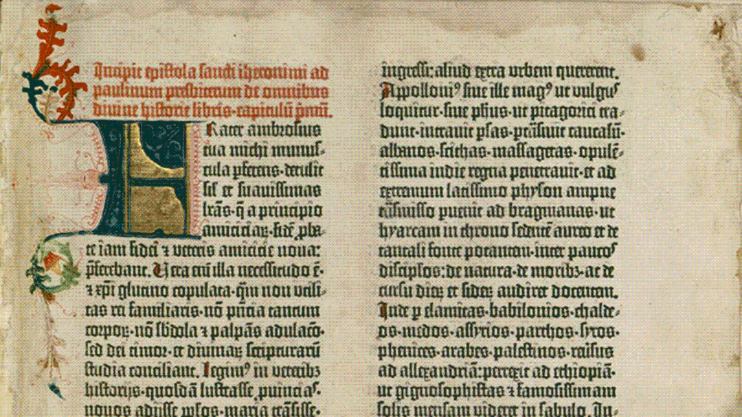
To understand why Comic Sans is good, we have to look back at the history of typography. More specifically we need to go all the way back to the Gutenberg Press; the first known printing press in the western world. The first book that Johannes Gutenberg printed with his printing press was the 42-line Bible. Gutenberg typeset this book in a textura typeface, which he carved by hand. This is significant because his textura typeface has its roots in Carolingian minuscule, a calligraphic standard from medieval Europe that was employed by scribes of the time period who used it to write out books by hand in their scriptoriums. By making his typeface mimic the handwriting of scribes, Johannes Gutenberg was able to make the transition from handwritten books to mechanically printed books much smoother.
In much of the same way that Gutenberg’s typeface mimics the handwriting of medieval scribes, one could argue that Comic Sans mimics the handwriting of writers who use the latin alphabet. Furthermore it is my sincere belief that Comic Sans had a similar effect as Gutenberg’s typeface: it made the transition from physical methods to digital methods was also made smoother.
Many see Helvetica and Times New Roman as the work horse fonts of the digital age. They’re basically everywhere. But the problem that lies in both Helvetica and Times New Roman are their sophistication. Helvetica has the air of clean sophistication of the Swiss Modernists mixed in with the corporate authority of the International Style. Times New Roman on the other hand is too blunt, boring and academic. But the biggest flaw of them both is their meticulously measured proportions. Since they were carefully designed and measured out to be clean and uniform, they have little to no connection to the human handwriting and are purely industrial. Comic Sans just looks at you and smiles. Its essence is unmistakably human: its imperfect design is what makes it so natural and alive. Its rough and uneven strokes aren’t ugly, they’re playful and fun. Its entire existence screams to be printed in multiple colours.
And that’s not all, in recent years Comic Sans has come to be used in a much nobler cause. The non-uniform nature of the characters in Comic Sans make it a perfect font for folks with dyslexia. Since the characters — like for example p and q — are so irregular and distinct, those with dyslexia are able to distinguish different letters much easier than if it were a font with much more uniform repeated shapes like Helvetica. Plus since Comic Sans was created for Microsoft and has been included as a Windows system font since 1995, it is also one of the most widely available dyslexic font.
To me, thats what makes Comic Sans beautiful. Yes, it may not be the most technically beautiful typeface. But it contains an essence, a warm cozy feeling that you get when you see it. It reminds us that we’re humans, and not perfection seeking industrial machines. I too used to hate Comic Sans; every time I saw it used in my high school math teacher’s lectures I used to cringe. But as I’ve grown older — and some may even argue wiser — I’ve come to not only accept Comic Sans’ place among typefaces, but love it too.