Die Neue Typographic Quest
An analysis of Carl Dair's A Typographic Quest
Carl Dair’s series of pamphlet’s entitled A Typographic Quest (1964-1968) was a project created for the West Virginia Pulp and Paper Company 1 with the intention of being sent out to North American printers, typographers, and graphic designers.2 By examining both the formal properties of Carl Dair’s design alongside the historical context of their creation, I believe that it becomes really clear that the series A Typographic Quest — along with Dair himself — were not strictly modernist nor postmodernist; they were something in between.
1. For the sake of economy I will be referring to the West Virginia Pulp and Paper Company by their shortened name westvaco.
2. When the pamphlets were published it is likely that graphic designers in Canada were still referred to as either graphic artists or commercial artists.
3. All of the example figures from A Typographic Quest that I have included in this analysis are printed at actual size. See pages 7 to 18.
Upon first glance, the pamphlets stand out because of their unusual proportions 3 of 5 ¼″ by 9″. I initially thought this was very odd considering that Carl Dair and his contemporaries are taught to students as Canadian modernist designers, whose work were heavily influenced by the works European modernist designers; specifically that of Jan Tschichold (Dair, 2015, pp. 19-21). In Jan Tschichold’s Die neue Typographie (1928) one of the major things that he argues in favour of in the printing industry is the standardization of paper sizes (Kinross, 1992, pp. 91-92). So that raises a question: would Dair’s use of a bizarre, non-standardized size not be an outright rebellion against the teachings of Tschichold and his new typography?
At first I thought that it was, but after doing some digging around I came across something major. In 1957 Jan Tchichold published his scathing article Zur Typographie der Gegenwart. Which railed against the Swiss Style for lacking what Tchichold referred to as ‘Anmut’, which translates as gracefulness or, as Robin Kinross put it, “the quality of work done with love and attention to the smallest details.” (Kinross, 1992, p. 128). Less than one year before it’s publication, Jan Tchichold and Carl Dair met up for lunch:
“I believe that what I wrote in Die Neue Typography [and] Typographische Gestaltung was sound [and] right. I was trying to break through the narrow limitations which restricted typography and widen it’s horizons. The result was, however, a mere substitution of new rules by those who considered themselves pupils of [mine], and a new academy came into being. This, instead of widening horizons narrowed them, [and] the whole aim of Die Neue Typographie was defeated by making it The New Formula” (Dair, 2015, pp. 20-21 ).
According to chapter two of Carl Dair’s Epistle to the Torontonians (2015), this was nearly verbatim of what Jan Tschichold told him over that meeting (pp. 20-21). This tells us two important things: Dair got to see Tschichold’s shift from the new typography towards traditionalism first-hand, and Dair got to hear Tschichold’s true intentions behind the new typography. Because here is the thing, while Jan Tschichold might not have been aware of it at the time that he met with Carl Dair, the two of them were very similar in one very important way. Unlike most of the other graphic designers and artists in the avant-garde, they both shared a keen ability to, “articulate theory in practical terms and [they] could engage in dialogue with both traditionalist typographers and the printing trade.” (Kinross, 1992, p. 97). It is clear to me that, upon returning home to Canada, Carl Dair was able to learn from the mistakes of Jan Tschichold’s new typography and embrace the ideas that Tschichold was telling him in their meeting in his quest to create his own typographic guide based around what he called ‘20th Century Classicism’ (Dair, 2015, p. 65).
Do not, however, let the term 20th Century Classicism fool you. Carl Dair in no way sought to return to the past in a wave of antimodern vigor. No, it is my belief that he sought to use the good that came from the modernist design movement in conjunction with traditional typographic values and a hint of experimentation in order to push Canadian graphic design to the forefront of international design. While he was getting close, I do not think that this means that Dair was a full-fledged postmodernist swimming in the “chaotic currents of change as if that is all there is” (Harvey, 1990, p. 44). Because while Dair does seem to recognize from his talk with Jan Tschichold that it is impossible — dangerous even — to try to forcibly create a unified representation of the world through his design theory and work (Dair, 2015, pp. 19-23; Harvey, 1990, p. 52), at the end of the day A Typographic Quest is still a modernist project. It is a series that was shaped around universal rules for the use of typography that Carl Dair wished to be to the spread out to and put into use by the printers, typographers, and graphic designers of North America (Harvey, 1990, p. 24-25).
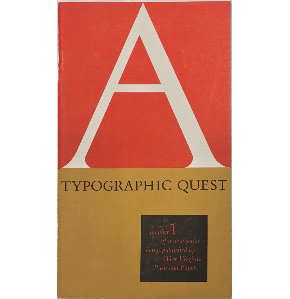
From just the covers alone any reader can tell that Dair’s design for A Typographic Quest was very well thought out. Take the cover of the first issue of A Typographic Quest 4 as an example. I think Dair is quite clever here: since this first issue is meant to be an explainer about what exactly typography is, Carl Dair decided to make a hand drawn capital A knocked out of a vibrant red square take up over half of the cover (Dair, 1964, p. 28). This signifies to his readers that he is not just covering the most important pieces, he is covering the subject of typography from A to Z.
5. This even includes to some extent Carl Dair's own book Design With Type (1967), which is more copy heavy than graphic heavy.
And he continues the same clever design style throughout the covers and interior spreads of his pamphlets. I would even argue that Dair’s thesis for design education in these books become evident through their design. Most all of the guides and rulebooks for graphic design and typography up to this point lead with theory presented as large chunks of body text, only ever using visuals as supplementary examples to the text.5 Yet here we see Carl Dair trying to break through the narrow limitations of design education by leading with visual explanations, limiting the amount of copy to as little as possible, and only ever using his copy as supplementary information. You can understand most of the concepts covered in each of Carl Dair’s six pamphlets without even reading his textual explanations. Not only that, the visual explanations are intelligently entertaining and they burst of off the pages with playful character.
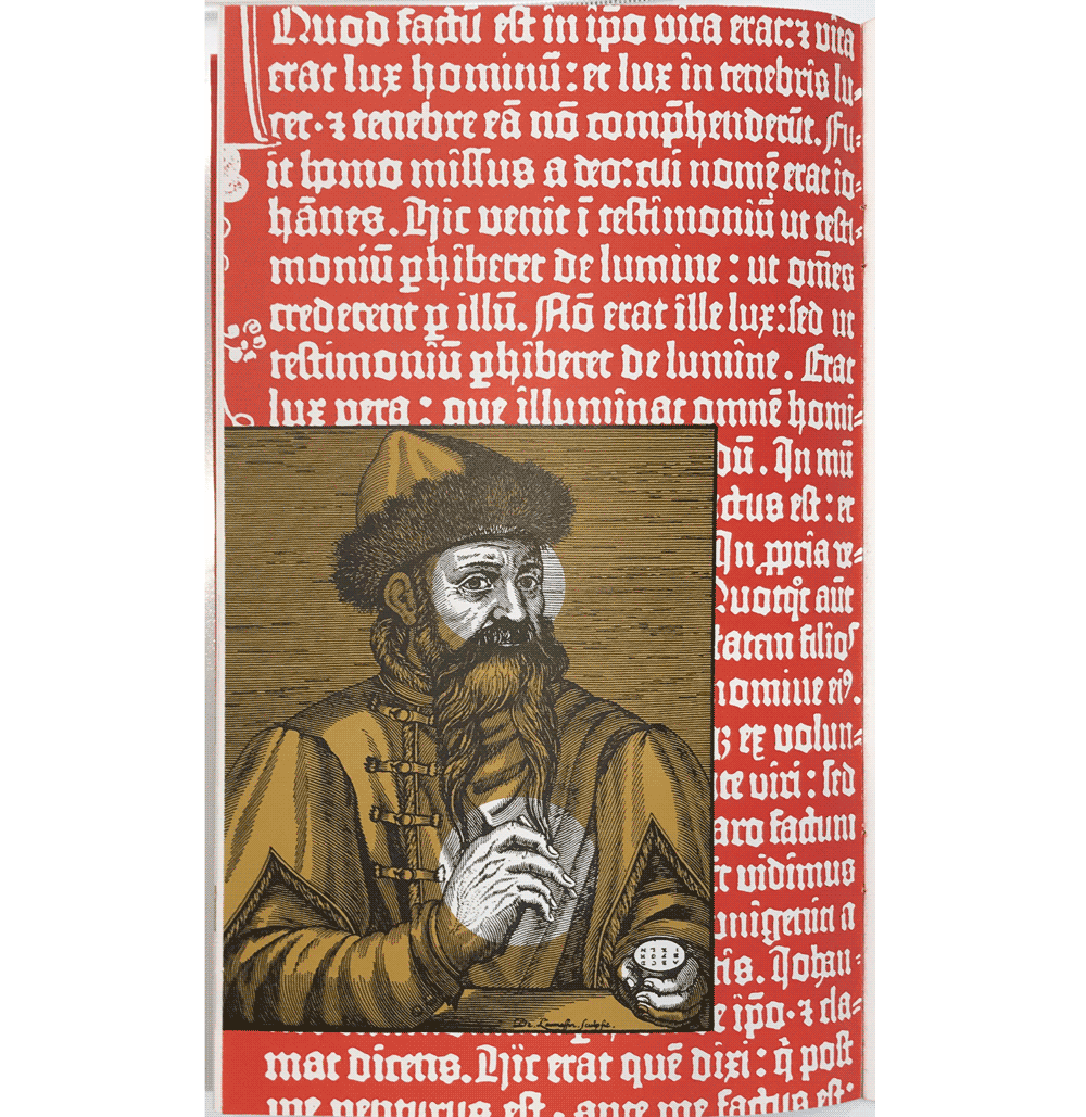
Look at page 6 of the first issue of A Typographic Quest.6 In this spread Dair is talking about the early days of printing in the western world. However instead of opting to use the two historical images — one of a specimen from the Gutenberg Bible (c. 1450) and the other of Johannes Gutenberg himself — as is and laying them out one next to another in a grid, Dair decided to modify them and then overlay them. For the background Dair took the unique type from the Gutenberg Bible specimen and knocked it out of a block of the same vibrant red that is used on the front cover. Then for the foreground Dair overlayed a light brown filter over the line illustration of Johannes Gutenberg, but left three circles — one around his mind and one around each of his hands — that are unaffected by the filter to create a focal point in the image. This page, along with many of the other pages in these pamphlets — like page 4 7 of the second pamphlet and page 25 8 of the fifth pamphlet — are Carl Dair’s way of showing readers that the rules he is laying out are not strictly set in stone. That experimentation in your work is not just allowed, but encouraged. The only caveat is that — as Jan Tschichold told him — the experimentation should have a purpose in the design, it cannot just be there for the sake of being different (Dair, 2015, p. 23).
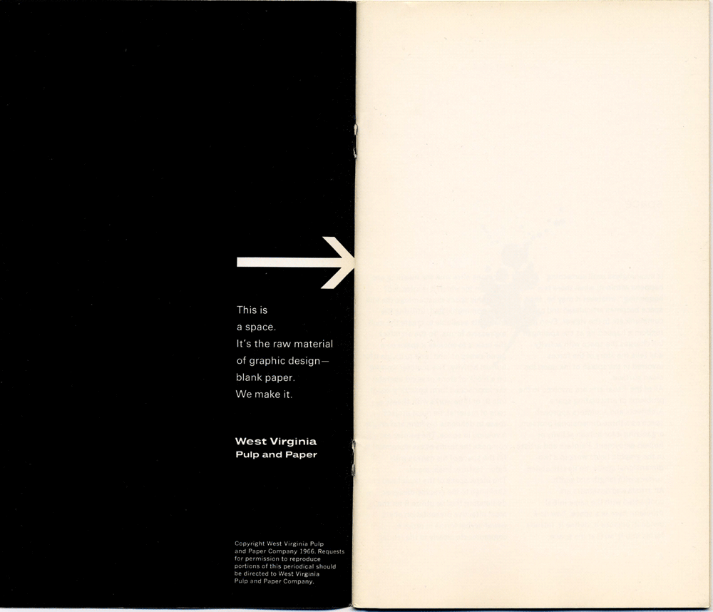
It is also important to note in this analysis that these pamphlets were not solely meant to be used for educational and entertainment purposes. These pamphlets were also a huge, and I should also add quite smart, advertisement for westvaco. It was a truly ingenious symbiotic relationship: Dair wanted to reach an audience of young printers, typographers, and graphic designers and teach them about the fundamentals of typography, all the while westvaco was looking for new ways to advertise their paper stock to potential clientele. And Carl Dair being Carl Dair, he refused to let any square inch of the pamphlets go to waste. So instead of just slapping the westvaco logo on the booklet with ‘buy now’ text attached, he used the advertisements for westvaco as a way of further explaining his typographic lessons visually. Take a look at the inside front cover of the fourth A Typographic Quest for a moment.9 This pamphlet, entitled The Organization of Space (1966), is meant to teach readers how to utilize space well in their design work. So when Dair was preparing the westvaco ad for the inside front cover of this pamphlet he made the clever decision of making a spread that contrasted positive and negative space. The left-hand page is black with a single column of white type anchored to the bottom right of the page. Directly above this column of text is a heavy arrow that points to the right-hand page, which is was left blank to create a strong visual contrast between the two pages in the spread while simultaneously creating an effective literal example of what exactly westvaco sells; quality sheets of paper.
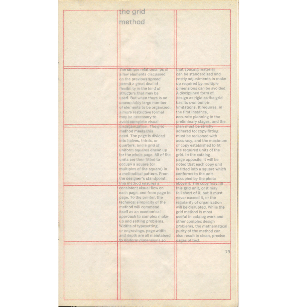
Going even further, there are elements in these pamphlets that would have been fairly out of reach for Dair had he not partnered up with westvaco. Delving further into The Organization of Space, on page 19 10 Dair makes use of a translucent vellum with a document grid finely printed on it in bright red. This grid is able to be overlayed on either page 18 or 19 to show readers how the use of a document grid works visually in each composition. However, if Dair was not making these pamphlets in partnership with a paper company, I highly doubt that he would have been able to include one of these vellum pages — let alone three — on a mass scale due to the expensive nature of vellum.
11. I am basing this off of the publication date of Foucault’s work from 1972, who Harvey uses as one of the first important postmodernist thinkers.
13. While the sixth pamphlet etcetera (1968) wraps the series up nicely, I cannot help but wonder if Dair saw this work in the same way that he saw Jan Tschichold’s Die neue Typographie, as “an unfinished work [that he] will not finish“ (Dair, 2015, p. 23).
The point that I am getting at is that while the prevailing narrative seems to be that Carl Dair — and by proxy his work A Typographic Quest — is modernist; I feel that both the visual and historical evidence proves otherwise. While Carl Dair was not an outright postmodernist — the term would not have been in wide use until after he passed away (Harvey, 1990, pp. 45; Bayefsky & McLeod, 2001, p. 10) 11 — he was not strictly a modernist either. In one of his letters he uses the idea of 20th Century Classicism to describe the graphic design movement that he and his contemporaries were a part of (Dair, 2015, p. 65). I think this term is an appropriate descriptor of Dair, as it neatly captures his fractured state between traditionalism, modernism, and outright experimentation. How else are we supposed to describe a man who is at one moment creating a set of universal typographic don’ts, and then six pages later explaining how to use decorative ornament 12 (Dair, 1968, p. 13; p. 19). Like many of the great artists and visionaries before him, Carl Dair died too soon. Who knows, had he lived longer he might have become a full fledged postmodernist. And while we can never truly know if his typographic quest was complete,13 I believe that the A Typographic Quest that we do have has provided us with the new typography for our postmodern age.
Find a Copy
A Typographic Quest is fairly rare as of writing this; I last saw it available on AbeBooks for a meager $300 Canadian. So if want to read it or are simply interested in learning about Carl Dair, I've uploaded .pdf files of all six booklets for download on the Internet Archives here. However, if you ever have a chance to see them in real life I highly recommend it as the screen simply doesn't do the printed booklets justice. I know that York University and the University of Toronto both have copies in their libraries.
Bibliography
- Bayefsky, E., & McLeod, D. (2001). A Brief Chronology of the Life and Work of Carl Dair. The Devil’s Artisan, 48, 6-10.
- Dair, C. (2015). Epistles to the Torontonians: With articles from Canadian Print & Publisher. (pp. 19-23; 62-65). Toronto: Coach House Press.
- Dair, C., & West Virginia Pulp and Paper Company. (1964). A Typographic Quest. [Pamphlet].
- Dair, C., & West Virginia Pulp and Paper Company. (1965). A Typographic Quest: Display Types. [Pamphlet].
- Dair, C., & West Virginia Pulp and Paper Company. (1965). A Typographic Quest: Type to Be Read. [Pamphlet].
- Dair, C., & West Virginia Pulp and Paper Company. (1966). A Typographic Quest: The Organization of Space. [Pamphlet].
- Dair, C., & West Virginia Pulp and Paper Company. (1967). A Typographic Quest: Graphic Contrast. [Pamphlet].
- Dair, C., & West Virginia Pulp and Paper Company. (1968). A Typographic Quest: etcetera. [Pamphlet].
- Harvey, D. (1990). The condition of postmodernity: An enquiry into the origins of cultural change. (pp. 10-38; 39-65). Cambridge, MA: Blackwell.
- Kinross, R. (1992). Modern typography: An essay in critical history. (pp. 85-112; 123-133). London: Hyphen Press.