The Modernist’s
Grandfather
Owen Jones, The Grammar of Ornament, and their connection to modernist design principles
1. This assertion is based on data from The Ngram Viewer from Google on the use of the term ‘modernist’ in books from 1851, the year of the Great Exhibition, to 1951.
The human race has a tendency to see and study history by looking at particular, brief, and often arbitrarily defined periods in the past. But when the history of the human race is looked at not just through specific predefined periods, but as a whole, new historical narratives can be uncovered. Ones which show how history and social change progress over long periods of time. Take Owen Jones, a vital member of the British Arts and Crafts movement of the nineteenth century, as an example. Although Jones and his seminal work The Grammar of Ornament — along with his design theories overall — were incubated well over a half century before the term modernist1 became widely used, there is no doubt that Jones should be seen as a modernist thinker. And as such his work should be seen, not only as a part of the British Arts and Crafts movement, but as a very early work of the modernist design movement as well. While his work was not the pure and polished form of modernism that would become the norm in the twentieth-century, Jones seems to have facilitated the transition from the traditional use of ornament into more modernist doctrines. The design theories outlined in his aforementioned seminal work The Grammar of Ornament fit perfectly into the criterion to which the modernists of the twentieth century valued; function over decoration, universal design techniques, and a rejection of tradition in favour of the contemporary.
In order to understand how Owen Jones and his book The Grammar of Ornament facilitated the transition to modernism, one must first understand the vital principles within Jones’ seminal work. Throughout his written work, Jones uses the term Decorative Arts to encompass the entirety of the visual arts field — including what would later become known as graphic design.⚬ For the purpose of this essay the field of graphic design will be then lens used to look at and examine Jones’ writings; not the entirety of the visual arts field. In The Grammar of Ornament, Jones laid out what he believed to be the general principles of good design through the use of thirty-seven propositions. In this essay the focus will be specifically on the third, fourth, fifth, and thirty-sixth propositions. These propositions display Jones’ core design ideologies; the universal criterion of good design in the third and fourth propositions, the importance of function over decoration in the fifth proposition, and the importance of rejecting tradition in the thirty-sixth proposition.
Starting with proposition three, Jones posits that all works of graphic design should possess fitness⚬, proportion, and harmony⚬. The fulfillment of these criterion, Owen Jones claims, will result in a visually cohesive composition. Jones then goes further in his fourth proposition to claim that ‘true beauty’ results from a visually cohesive composition, of which contains the previously stated criterion from proposition three, that leaves the viewer without any want. When humans are visually, intellectually, and emotionally satisfied by a work of design then they — the viewer — should be left satisfied overall; absent of any need or wanting from the design piece in question.
Next in proposition five, Owen Jones argues that, “Construction should be decorated. Decoration should never be purposely constructed.” (Jones 4). Essentially to Jones, the beauty of any given piece graphic design does not come from its ornamentation or embellishments, it comes from the core essence and purpose of its being. Good pieces of graphic design place functionality ahead of beauty and ornamentation. Therefore through this logic, if one were to entirely remove the ornamentation and embellishments of any good piece of design work, then the resulting piece should still be inherently beautiful. Decoration should only be added to pieces in order to improve its visual cohesiveness, and not for any other reason.
In proposition thirty-six, Owen Jones argues in favour of a rejection of the past in favour of the contemporary. He insists that instead of blindly copying tradition and the normative styles of the past, graphic designers should instead opt to study the aesthetic theories and techniques that our ancestors laboured for thousands of years in order to accumulate. Then, with the theories and techniques of the past at their disposal, graphic designers will be able to create new and fresh pieces of contemporary graphic design of which will reflect the zeitgeist of their time. “The principles discoverable in the works of the past belong to us; not so much the results.” (Jones 6).
Fig. 1: Knoll International
Vignelli Associates, 1966
AIGA Design Archives
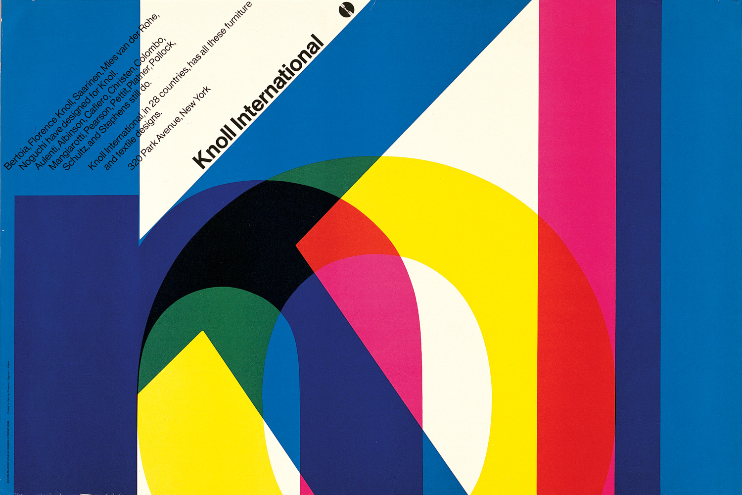
The modernist movement in graphic design was very much a normative movement, and the graphic designers of said movement valued order and universality in their designs. In order to achieve this, the modernists applied techniques that were the same as those that were outlined in The Grammar of Ornament’s third and fourth propositions. Good pieces of modernist design always contained fitness, proportion, and harmony. In order to achieve fitness, the modernist graphic designers created work without ornamentation, and focused on the functionality of their design pieces. They also utilized a plethora of different grid systems in order to add proportion to their work. In addition, modernist graphic designers made use of size, colour, form, space, texture, and direction in their works in order to instill a sense of harmony or visual cohesion in the viewers. Looking at the Knoll International poster (see fig. 1) — created by the Vignelli Associates, a New York City design firm which was founded on modernist ideals — as an example, it is evident that Owen Jones’ third and fourth propositions are at play. First off, the advertisement contains fitness: its function was to advertise the corporation Knoll International, which it achieves by designing the piece so that the first thing that the viewer reads is the companies name. Then the designer utilizes proportion by aligning all of the advertisement’s visual elements inside of a 6 by 6 grid system. Finally, the designer used harmony in the design. They used space and colour to differentiate the display type and the body type. The designer also incorporated direction, making the body type follow the same direction as the upper stroke of the letter k in the company’s name.
Fig. 2: CN Railways
Annual Report For 1961
By Gerhard Doerrié for James Valkus & Co.,
1962
Canada Modern Archive

Modernist graphic designers generally detested the use of ornament. The main perspective on ornament in the modernist movement — which most if not all good modernist designers employed in their work — was that of modernist architect Louis H. Sullivan who popularized the idea that form follows function. However, when Sullivan’s idea is further examined it becomes evident that it is just a simplified rephrasing of the earlier design principle that Owen Jones outlined in The Grammar of Ornament’s fifth proposition; construction before decoration. Take, for example, modernist designer Gerhard Doerrié’s cover design for the Canadian National Railways Annual Report 1961 (see fig. 2). It’s simple, functional, and elegant. It makes excellent use of the diagonal line pattern that is the staple of the CN rail car design. All of the text is blind embossed and anchored to the four corners of the front cover to maintain the simple functional aesthetic. While upon first glance this piece of design is completely free of ornament, upon further inspection one should see that both the blind emboss of the type and the center line pattern are in fact unnecessary embellishments; otherwise known as ornaments. Although the ornamentation of choice for the modernist graphic designer were no where near as gaudy and eclectic as those of Jones’ period; opting instead for ornaments that were simple, abstract, and geometric. Much like Owen Jones, the designers of the modernist movement knew that decorative elements should only be added to design pieces after they become structurally functional, and decorative elements should only be added in order to improve a design piece’s visual cohesiveness; and not for any other reason.
Fig. 3: Think Small
By Helmut Krone for Volkswagen, 1960
AIGA Design Archives
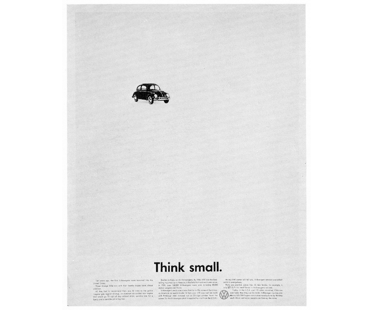
Perhaps what they were most well-known for was the modernist’s overt rejection of the past and its aesthetic styles. The reason they rejected the past was much like the reason with which Owen Jones rejected the past. Both Jones and the modernists saw the problematic nature of appropriating the styles of the past. The majority of graphic designers of their eras were not using the styles of the past as a study tool, instead the majority of graphic designers were thoughtlessly copying and pasting the styles of the past into their contemporary works. Moreover, both Jones and modernist designers knew that it would be ridiculous to completely abandon the knowledge of the past in favour of the future; seeing as the future and all of its technologies are built upon the work of the past. Look at the famous Think Small advertisement by Helmut Krone for Volkswagen of America. It seemingly contains no traces of the aesthetic movements of the past — Art Nouveau, Victorian Arts and Crafts, Japanese Woodblock, the Renaissance, etc. However, upon close inspection it is quite evident that Krone’s advertisement employs the same techniques and tools that the works of the past used. The Volkswagen car uses the traditional artistic principles of size, space and direction in order to make the viewer feel like the vehicle is moving. Then the advertisement uses the traditional technique of contrasting visual weights in order to create visual tension in the piece.
Although Owen Jones has commonly been seen as a member of the British Arts and Crafts movement, the values found within his design ideologies are modernist in nature. His work was not the pure and polished form of modernism of the twentieth century, but Jones essentially facilitated the transition from the traditional to modernist doctrines through his design criterion; function over decoration, universal techniques, and a rejection of tradition and the past in favour of the present.
- Benjamin, Walter. “The Work of Art in the Age of Mechanical Reproduction.” Lees-Maffei, Grace and Rebecca Houze. The Design History Reader. Berg, 2010. 429-434.
- Conrads, Ulrich. Programs and Manifestoes on 20th-Century Architecture. Cambridge: The MIT Press, 1971.
- Eskilson, Stephen J. Graphic Design: A New History. 2nd Edition. Yale University Press, 2012.
- Jespersen, John Kresten. “Originality and Jones’ The Grammar of Ornament of 1856.” Journal of Design History 21.2 (2008): 143-153.
- Jones, Owen. “Gleanings from the Great Exhibition of 1851.” The Journal of Design and Manufactures 5.28 (1851): 89-93.
- Jones, Owen. The Grammar of Ornament. London: Day And Son, 1856.
- Ngram Viewer . n.d. Google. 21 October 2018. Web Link.
- Parsons, Glen. The Philosophy of Design. Polity Press, 2016.
- Sloboda, Stacey. “The Grammar of Ornament: Cosmopolitanism and Reform in British Design.” Journal of Design History 21.3 (2008): 233-236.
- Sullivan, Louis H. “The Tall Office Building Artistically Considered.” Lippincott’s Magazine 23 March 1896: 403-409.
- Tschichold, Jan. “New Life In Print.” Bierut, Michael, Jessica Helfand and Steven Heller. Looking Closer 3: Classic Writings on Graphic Design. Allworth Press, 1999. 45-49.
- Vignelli, Massimo. The Vignelli Canon. Lars Muller, 2015.
Bibliography